
UX DESIGN • WEB DESIGN • MOBILE DESIGN
Earning Essential Trust Amid Grief
Year: 2024
Role: Sole UX/UI Designer
Project Type: Conceptual Project Sprint
Time: 10 Days
Tools: Figma
The Challenge
PROMPT
“If a new tool has been created, tested, and validated, but no one knows about it, is it still useful?”
INTRODUCTION
RADPSL (Remembrance After Death Planning and Support Line) is a fictional concept for a free, automated call-in line that offers guidance and emotional support to people navigating the challenges of funeral planning. If it were a real product, thoughtful as the idea may be, it still couldn’t make an impact unless people knew it existed.
In this 10-day solo design sprint, I wanted to create a web presence that would raise awareness of the service, communicate its value, and foster enough trust that people in need would feel compelled to use it.
The goal: demonstrate how a well-designed website could become a bridge between intention and impact.
Sprinting Toward A Solution

SETTING THE SCOPE
With limited time, competing priorities, and a team of one (me!), I knew I’d need to move quickly and resourcefully. My goal was to design and execute an MVP landing page that could effectively communicate the value of the service and encourage trust from potential users. To stay focused and efficient, I adapted the structure of a classic Google Ventures design sprint to guide my process.
I began by gathering and organizing the foundational research I had previously conducted while developing the call-in line. This became a working brief that outlined the sprint goals, key user insights, design constraints, and two primary personas. I also scoped out a rough 10-day timeline to keep myself accountable and on track.
DELIVERABLES
Low-fidelity sketches exploring landing page layout and content
High-fidelity MVP prototypes for user testing and design validation
Brief video presentation of the desktop prototype
Brief video presentation of the mobile web prototype
The Exploration
MAPPING OUT THE DESIGN
To lay the groundwork for the prototype, I started by clarifying assumptions and generating opportunities using How Might We questions—one of the most helpful being:
“How might we educate users about the ways this service can meet their planning and grief support needs?”
This helped me define the long-term goal for the service and narrow in on what the MVP needed to achieve. I then mapped out a simple user flow showing how someone might discover the support line through the website, learn about its features, and feel confident enough to make the call.
Finally, I zeroed in on a core user: a bereaved planner juggling emotional stress, logistics, and a need for accessible guidance. This early strategy work gave me the clarity to move faster in later stages while staying focused on the user's real needs.
Exploration work
SKETCHING IDEAS
With clear steps for the vision, I gathered inspirational resources and even a few samples from competitor websites to understand what visual experiences would be familiar to users.
While studying the examples, I made quick sketches of what flows and visuals would be most helpful for the established target user for RADPSL. These ideas were further iterated through Crazy 8 sketches and refined sketches for the user story.
Paper sketches
NARROWING THE OPTIONS
A few neat ideas were generated thanks to the thorough rounds of ideating and sketching. It was important to remember that some ideas served the need stronger than others.
Those concepts were highlighted with dots and explored further through a storyboard of the user's journey to discovering the landing page and then deciding to call the support line.
Voting on ideas
The Beautiful Bare Minimum
JUST ENOUGH DESIGN
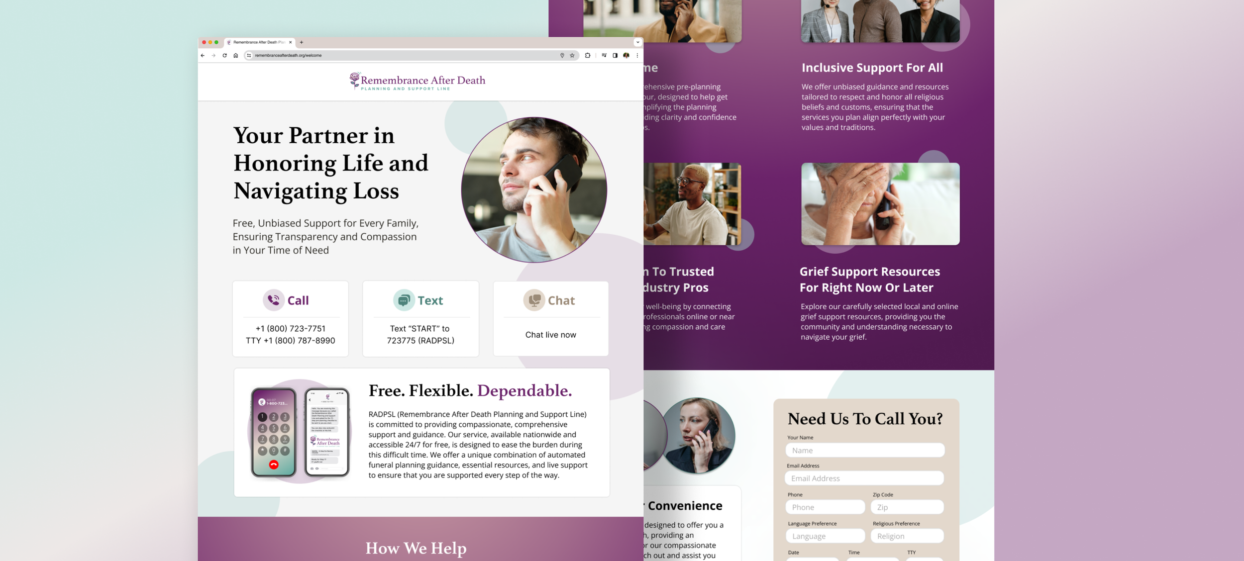
From the storyboard, a low-fidelity desktop wireframe for the landing page was designed. This step helped finalize ideas and make any minor adjustments before creating the high-fidelity desktop design and its mobile version. These would be used as part of a simple prototype to validate whether users felt the site was informative and trustworthy.
KEY ELEMENTS
Strong header messaging that was welcoming, empathetic, and highly informative about the support line
A friendly face to settle the user
Calls to action are teased just above the fold so that users know to scroll down and are immediately greeted with the next steps.
Well-organized information that provides more context on the support line services
wireframe to hi-fidelity desktop design

hi-fidelity mobile design
GETTING REAL FEEDBACK, FAST
To validate my design decisions, I took a grassroots approach to user testing—reaching out to my local community, chatting with patrons at the public library, and even offering to buy coffee for anyone willing to join a short feedback session. I recruited five participants, ages 18 to 57, all with varying degrees of experience related to funeral planning.
Each usability test took place in person using either an iPad Mini or an iPhone 14. Sessions lasted around 10–15 minutes and began with a few quick questions about the participant’s background and how they might typically seek help during a time of loss. After a brief intro to the test, participants were asked to explore the landing page prototype.
My goal was to see if the landing page experience built enough understanding and trust that someone might pick up the phone and call the support line.
WHAT USERS TAUGHT ME
Users described the service as a convenient, “quick and painless” option for getting help during a difficult time. 4 of the 5 said the look and tone of the website helped them feel a sense of trust, and that it seemed credible rather than “suspicious” or “scammy”.
One especially valuable insight came from the youngest participant, an 18-year-old who noted that she would only explore a service like this if it appeared at the top of her search results. Whether she stayed on the site or bounced would depend entirely on how it looked, how fast it loaded, and how the information was presented.
This underscored a key takeaway: trust-building design matters, but visibility is just as important. For younger users in particular, being discoverable through search—and making a strong first impression—is critical. It reinforced that UX and marketing strategy need to work hand-in-hand when creating awareness for a service like this.
Learning & Reflection
BIG LESSONS FROM A SMALL SPRINT
From this experience, I see that adopting elements of the sprint - even as a solo designer and with changes to the timeline - was a great help in bringing me closer to the true sticking points of what would work for user conversions in a fully created website.
Also, users seem to respond differently to a convincing prototype. They can see the vision of what you are trying to accomplish, which excites them and encourages deeper insights.
If this were a real-world product, my next step would be to partner with developers and outreach teams to test the live MVP and optimize it for search visibility, ensuring the service actually reaches the people it was designed to help.


