UX/UI Design, Conversation Design
RADPSL: Offering Guidance
and Support to the Bereaved
Funeral Planner
Year: 2023-2024
Role: Sole Student UX/UI Designer
Time: 10 Months
Tools: Figma, Miro, Voiceflow
PROBLEM
End-of-life ceremonies like funerals and memorials are crucial for helping grieving families find closure and move forward. However, planning such events can be overwhelming and expensive, with families often needing help figuring out where to start or who to trust for guidance and support. This led me to consider…
How might we develop a way to make funeral planning less stressful and uncertain, ultimately improving the experience for those dealing with grief?

SOLUTION
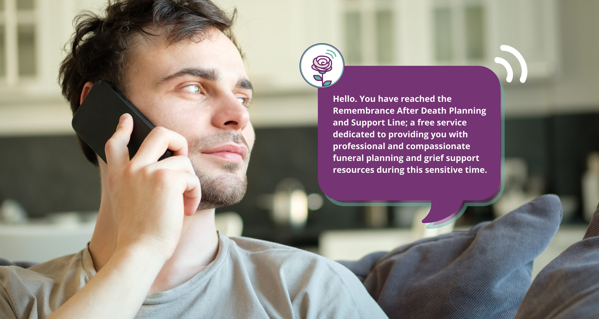
RADPSL (Remembrance After Death Planning and Support Line) is a free automated call-in line that offers convenient access to planning assistance and emotional support for the bereaved planner struggling to navigate the funeral planning process.
OBSTACLES
Though passionate about the issue, I had no direct experience with funeral planning and knew little about the industry. I relied on secondary research and 1-on-1 testimonies of others to make sure I understood the domain and the pain points of those who needed to memorialize a loved one. Unfortunately, I did happen to gain personal experience right in the middle of the design process—twice. More about that a bit later.
Discovery
THE BIG PICTURE
Despite the availability of online articles, web apps, and mobile apps for funeral planning, there is room in the funeral industry for accessible assistance that caters to individuals less comfortable with self-led information hunts and internet tools. Grief isn't a straightforward journey and can last a lifetime. Creating a memorial or remembrance for the deceased significantly aids in navigating this grief. However, that process can be daunting.
From navigating costs and legal requirements to honoring the wishes of the deceased, important decisions must be made, often amidst significant mental and emotional strain, leaving planners vulnerable to exploitation.
By establishing a call-in support line offering accessible personal assistance, quick access to pre-planning basics, and connections to reputable industry experts, bereaved planners can have a free supportive resource to help them navigate the plethora of options and plan a meaningful event that meets their family's needs.
But how did I arrive at this solution?
Let’s get into the details.
UNDERSTANDING THE DOMAIN
I started by conducting secondary research. My top research goal was to develop a well-rounded understanding of how bereaved families were currently making their arrangements so that I could make useful improvements in the funeral planning process.
The questions guiding my research were:
Who struggles with funeral planning?
What main factors impact funeral planning negatively?
What are the current common ways to plan for a funeral?
What alternatives or solutions are available to solve this problem?
Key Research Insights:
The continued rising cost of funeral and death-related services is having a severe impact on access to what is needed, as well as the long-term financial health of the bereaved.
Most Americans do not have a basic understanding of their rights around funeral planning or fair pricing exposure, leaving many vulnerable to corporate greed.
Raising awareness of consumer rights and the continued normalization of funeral/death pre-planning could significantly impact the quality of decisions made by grieving families regarding funeral planning.
COMPARING COMPETITORS
Various existing websites and apps address the planning and management of the end-of-life process. I looked closely at some of the most highly reviewed web-based solutions (Lantern, Betterleave, Empathy, and Cake) and two of the highest-rated mobile apps (Granate and Memento Vita).
Each of these is comprehensive to varying degrees, though my main thought about the web-based solutions is that their *systems may be overwhelming due to the amount of information and functions packed in.
The two mobile solutions—though simplified—*do not allow users to connect with planning assistance and emotional support from a real person. They are also limited to iOS only.
*Studied as of early 2023. These companies may have made changes since then.
A DEEPER DIVE
To gain a more direct understanding of the funeral planning experience, my primary research included a plan to screen and interview 1-on-1 people who had personally gone through the process or had been solid supporters of someone else during their planning journey.
I conducted 6 interviews to understand better where the current process for making arrangements was failing them and what planning pain points significantly impacted their experience. Interestingly enough, none of them mentioned using an app or website company to plan their funerals.
Sample section of affinity mapping of user Interview insights
Although they had all had different experiences, interviewees shared a few key sentiments about what they wanted most.
Emotional Support
Affordable and Accessible Arrangements
Practical and Legal Guidance
Wishes/Guidelines From The Deceased
“With the funeral home, I felt like it was less about my loss and closure and more about ‘hey, don’t you want to buy this additional thing while you’re compromised?’ I just wish I’d had someone to call who could help me and not sell me something.”
- user quote
“You know this day is going to come, but it comes, and you’re still overwhelmed.” - user quote
“Yea, they be scammin’ people sometimes, especially if you don’t have everything in order.”
- user quote
MAKING SENSE OF IT ALL
With the key insights from my reading and interview data in mind, I needed to go through a few more methodologies to make sense of all that I had learned. I created empathy maps, personas, and JTBDs to help me better align myself with the experiences of my interviewees and guide my upcoming design decisions.
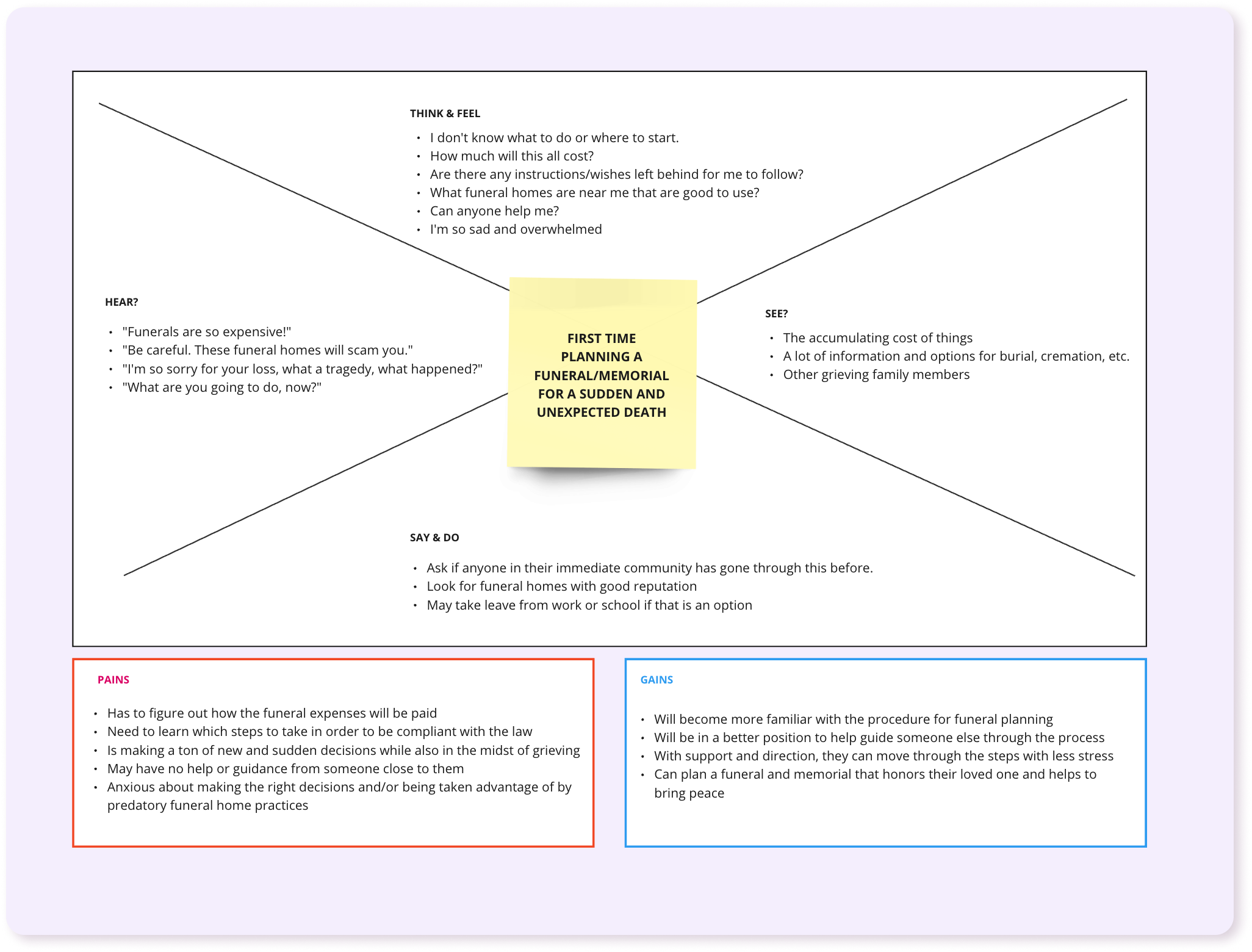
Empathy Map
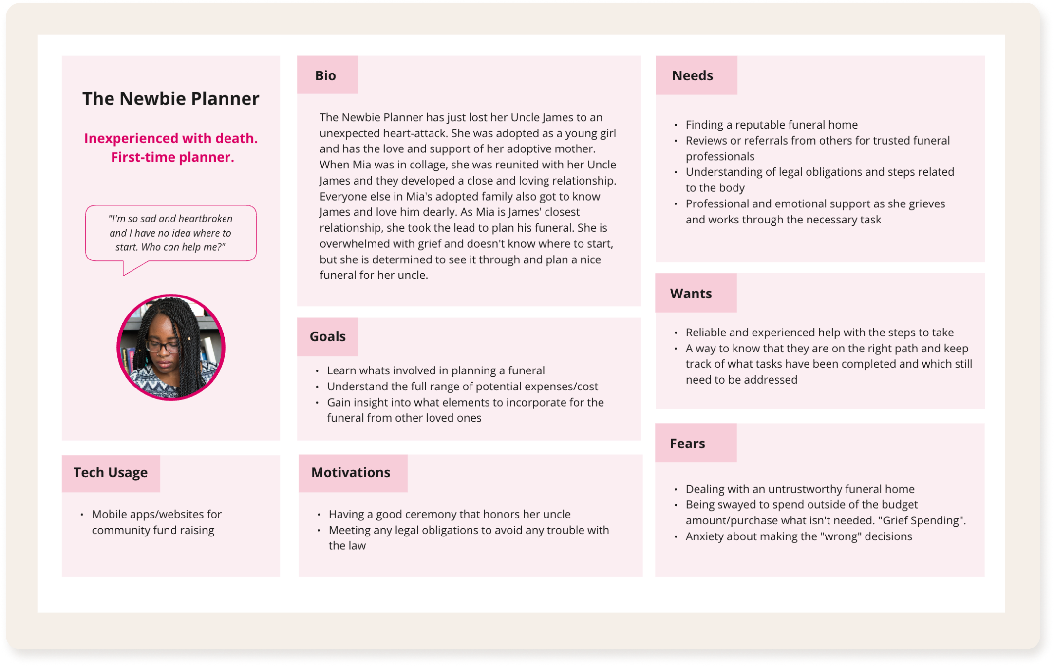
The Newbie Planner Persona
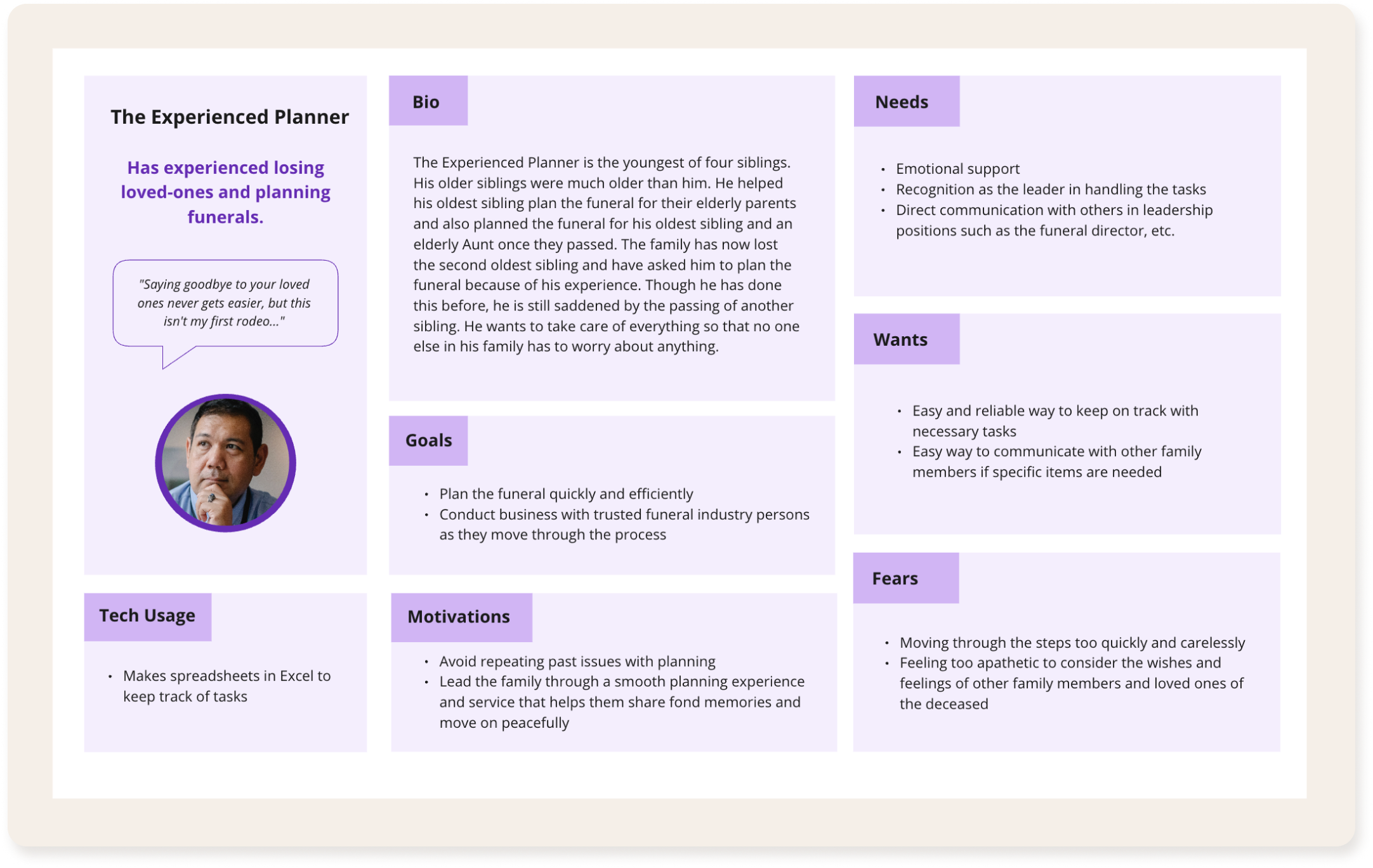
The Experienced Planner Persona
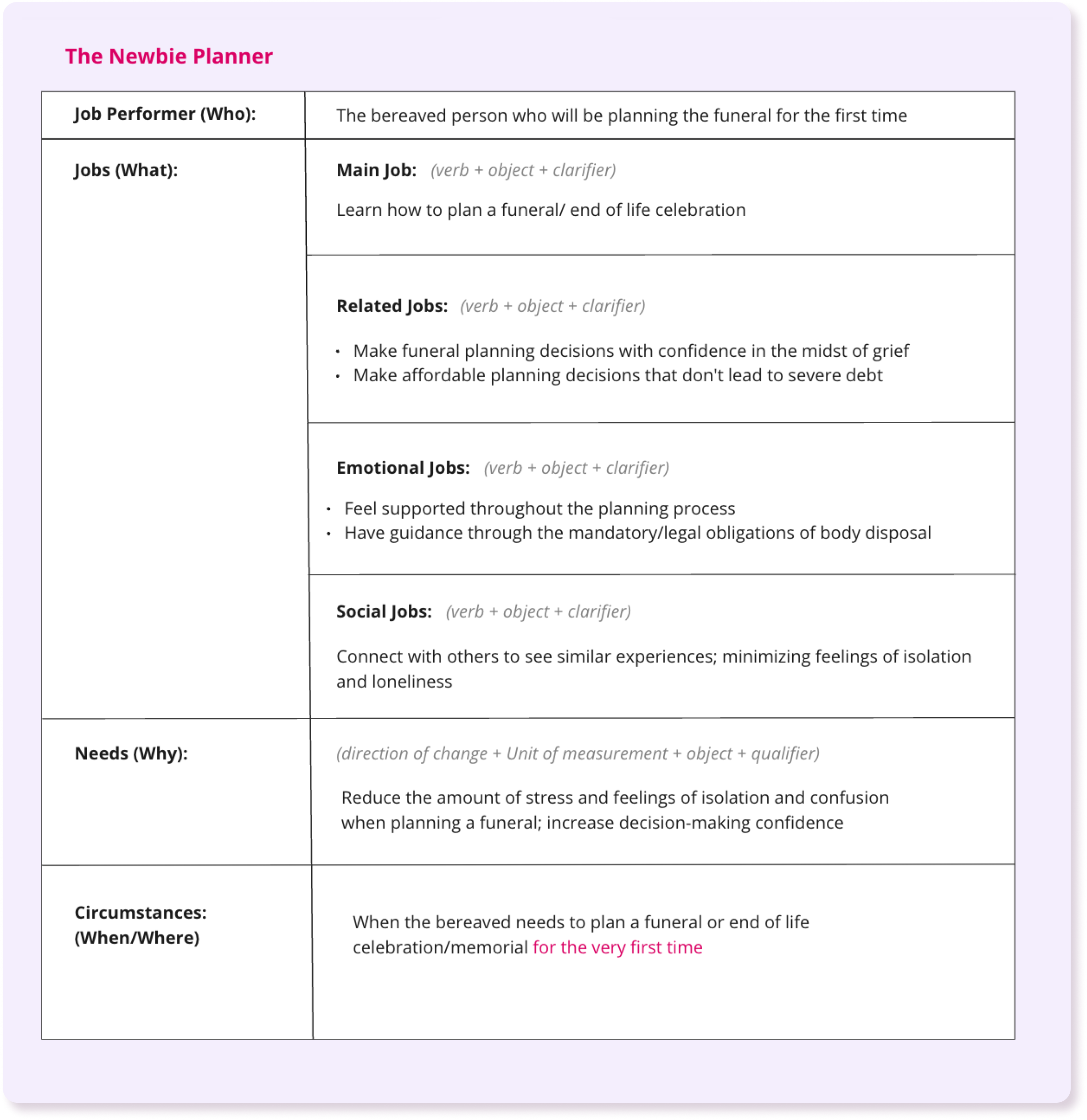
JTBD based on the Newbie Planner persona
Design
DEVELOPING IDEAS
Even with the data collected, I wasn’t entirely sold on what direction to head in for design. Would my digital solution be good enough? Did any of my participants show an inclination to want yet another app to deal with? After all, none of them had mentioned anything about having used any of the leading tech-enabled solutions that already existed.
Creating a list of How Might We statements based on the interview insights helped bridge this gap by reframing the situation through my users' eyes. I then sketched a quick sheet of Crazy 8s to push myself to explore a range of ideas—not just app solutions.
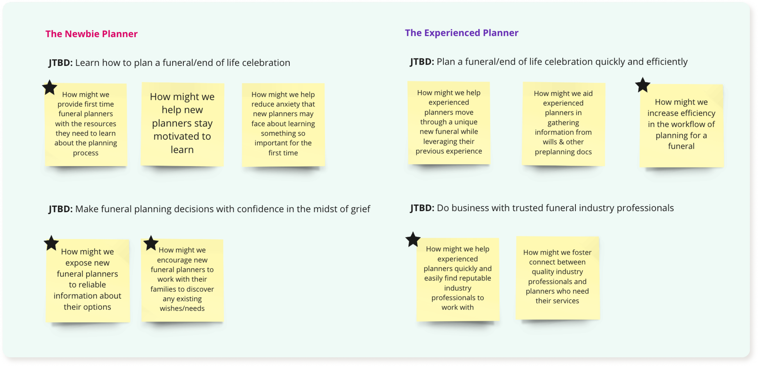
Small sample of HMW’s for exploration and ideation
INVOLVING THE USER
The Crazy 8 sketches were organized into a FigJam board to share with previous interviewees. Using the Kano model, I was able to decipher which concepts and features had the highest interest—a call hotline for assistance and support! I followed the trail of this revelation and created user stories to help name potential features and narrow down which could be suitable for an MVP.
Sample voting session
Kano model for potential MVP features
THE UNEXPECTED
In my opening summary of the obstacles of this project, I mentioned that I would come to gain personal experience right in the middle of the design process. Sadly, one of my friends passed from a long battle with illness. 3 months later, I lost my dear Aunt. While I had known the first death would come sooner than later, I was not prepared for the death of my Aunt. Suddenly, I had a new depth of understanding and empathy for my users. I also needed to take a step back from the project for a few weeks.
FLOW AND CONVERSATION
When I returned to the project, I reacquainted myself with the data and set out to craft a conversational experience that mattered. With a deeper level of empathy, I began designing the call flow for RADPSL. I studied other call lines to learn standard practices and read books about crafting conversation design to improve my approach and implementation of proper language, tone, and feel.
Improvement notes for conversation and call flow
Notes for conversation building
LAYING THE FOUNDATION
Using the low-fidelity wireflow and conversation designs, I once again turned to the user to verify that the concepts were landing. I conducted “Wizard-of-Oz” style testing where I was the automated voice on the line that read the options when chosen. Participants agreed that the hotline would be useful - particularly for those uncomfortable with self-led, tech-focused research or just too overwhelmed to start looking for help alone on an app or website.
Based on user feedback, other adjustments, and features were also incorporated into the red routes.
Some of those insights were:
To ensure that the word choice is succinct, aware, compassionate, and easy to understand - at a late grade-school level of understanding where possible.
The option to speak with someone directly would be present at every opportunity to make a choice or give information to the system.
Section of caller wireflow for getting planning information sent as a text
CRAFTING STYLE
As the product began to come to life, it was time to hunker down and give it a proper, relatable name. So, I created a moodboard and style guide. While the primary mode of interaction would be voice and input-led, it was still necessary to establish a visual identity for the call line to facilitate future development of a high-fidelity prototype and any supporting print or digital assets serving as touchpoints for users' interactions.
HIGH-FI PROTOTYPE
The feedback gained from testing the low-fidelity prototype paved the way for creating the high-fidelity prototype. I initially considered Figma for the build but ultimately chose Voiceflow for the efficiency of the built-in tools for conversation-driven products.
Users would now hear an automated voice welcoming them and guiding them through the call process. In an ideal real-world build of this support line, users would be able to speak or use their phone keys to input their selections. However, building tools for the prototype limited me to only one of those options. I chose for users to type their choices while presenting a visual of the standard modern smartphone dial-pad.
Video of intro call flow to the main menu (unmute to hear audio)
No audio? No problem! Check out the images below.

Call intro to the main menu (1 of 3)

Call intro to the main menu (2 of 3)

Call intro to the main menu (3 of 3)
Iteration
LIVING ROOMS AND ZOOM CALLS
Two rounds of usability testing for the high-fidelity prototype were conducted over a 2-week timeframe in-person and remotely. Round 1 of testing was insightful and would suggest a positive reaction from users. Users felt that the tone and language of the scripted call line were done well and came across as considerate, professional, and appropriately kind. They reported that the flow felt smooth for the majority of the interactions and that the service would be useful for those who aren't as comfortable with independent online research and want some insight on where to start with the funeral planning process.
THEY LIKE IT! BUT LET’S MAKE IT BETTER
Naturally, users also shared where they thought there were areas for improvement. That feedback was organized into a list of 9 usability issues, ranging from “critical” to “minor.” Adjustments were made, and a second round of testing was conducted with 5 new users.
None of the previous issues remained during the second round of testing and user satisfaction was increased! Users trusted the system to assist with connecting them to professionals who could be more of a direct help. They felt that the system was useful for those unfamiliar with the funeral planning process and that it was a good, low-pressure starting point.

Sample of improvements
WHERE DO WE GO FROM HERE?
After using the high-fidelity prototype, users shared how they liked having the visuals to read along with the automated voice. If I had more time, I would work on the expansion of the chat functionality so that users could text with the system when a phone call isn’t an option or if the user is deaf or hard of hearing.
Learning & Reflection
WHAT A JOURNEY!
This project was a daunting one from the start - how was I, a ux/ui design student, suppose to find a better way to navigate the ins and outs of something as intimidating as the funeral industry? But the topic was important to me and I had a lot of support from my family and friends. I was also pleased to realize that my years of previous branding experience and dealing with people - using their very real stories to inform design - was a tremendous help.
TOUGH SPOTS
As I’ve mentioned throughout this study, I came into this project with no personal experience with funeral planning. Don’t get me wrong; I don’t think one needs to have personal experience with every problem they are trying to solve but to have come face-to-face with something as painful as losing someone you love and trying to put something together for your own closure is a distinct experience. It was also a bit of a challenge to keep focused on my solution features because the competitors were making active changes to their offerings way faster than I could have expected or kept up with.
TAKEAWAYS
When feeling stuck or in doubt about the direction of the design, always refer back to the research. Always refer back to the user. Sometimes, what you set out to create isn’t what the process leads you to do. Regular involvement of users throughout the entire design journey will guide you to a solution you couldn’t have come up with on your own. Also, people are really willing to help, especially if you show them that you respect their time and value their unique perspective.
Something I would do differently is allocate more time to scheduling conversations with users. Whether it was a research call or a usability testing call, aligning with people’s busy schedules took more time than I had anticipated.
Next Project
